Frustration se flow tak: Cursor IDE me Jupyter Notebooks aur LLM ke saath mera safar
Problem: LLMs aur Jupyter Notebooks naturally achchhe dost nahi hote
Raat ke 2 baje maine finally maan liya ki main atak gaya hoon. Mera genomic sequencing analysis isliye ruk gaya tha kyunki Cursor IDE ke andar LLM assistant meri Jupyter notebook ki complex JSON structure ko sahi tarah samajh nahi pa raha tha. Jab bhi main AI se visualization code me help mangta, woh broken JSON de deta jo load hi nahi hota tha. Maine snippets bhejne ki bhi koshish ki, lekin usse preprocessing context chala jata tha. Upar se teen alag windows khuli hoti thi: browser me Jupyter, “real coding” ke liye VSCode, aur documentation ke liye ek aur editor. Jupyter format aur LLM limitations ka combo, plus constant context switching, data work ko almost impossible bana raha tha. Iris jaisi simple benchmark dataset par bhi ye basic incompatibility meri productivity ko kill kar rahi thi.
Kya ye familiar lag raha hai? Data science workflows me context switching especially painful hoti hai. Aap lagatar in cheezon ke beech bounce karte ho:
- “Serious” programming ke liye code editors
- Exploration ke liye Jupyter notebooks
- Findings share karne ke liye documentation tools
- Charts banane ke liye visualization software
- Browser me khule ChatGPT aur Claude
Har switch mental energy leta hai aur discovery ko slow karta hai. Lekin agar isse better tareeka ho to?
Video tutorial pasand hai? Maine is poore workflow ka step-by-step video banaya hai. Jupyter Notebooks in Cursor IDE Tutorial with AI-Powered Data Analysis dekhen.
Discovery: Cursor IDE me unified data science workflow
Phir mujhe ek aisa solution mila jisne mera workflow badal diya: Jupyter notebooks ko direct Cursor IDE ke andar use karna, AI ki help ke saath. Is approach me ye sab combine hota hai:
- Jupyter ki interactive cell-based execution
- Proper IDE ki editing aur navigation powers
- AI assistance jo code aur data science dono context samajhti hai
- Plain text files jo version control ke saath bahut achchha kaam karti hain
Is article ke end tak aap dekhenge ki maine aisa integrated environment kaise banaya jahan main:
- Minimal coding ke saath datasets analyze aur visualize kar sakta hoon
- Hidden patterns dikhane wali 3D visualizations bana sakta hoon
- Findings ko code ke saath hi document kar sakta hoon
- Ek command me professional reports export kar sakta hoon
- Ye sab alag tools ke beech switch kiye bina kar sakta hoon
Chaliye shuru karte hain.
Cursor IDE me Jupyter environment setup karna
Har achchhe workflow ko thodi preparation chahiye hoti hai. Jupyter ko Cursor IDE me sahi tarah setup karne ke liye hume tools install karne aur environment configure karna hoga.
Jupyter extension install karna
Magic Jupyter extension se shuru hoti hai:
- Cursor IDE kholen aur project folder banayen
- Sidebar me Extensions par jayen
- “Jupyter” search karein aur official extension dhoonden
- “Install” par click karein
Ye extension traditional notebooks aur IDE ke beech bridge ka kaam karti hai. Isse ek powerful feature milta hai: aap regular Python files me special markers use karke executable cells bana sakte ho. Matlab .ipynb ke complex JSON ke bajay plain text Python use kar sakte ho.
Jupyter Notebook ke bare me aur detail chahiye ho to official documentation dekhen.
Python environment prepare karna
Extension install ho jane ke baad ek clean Python environment banate hain:
python -m venv .venv
Phir dependencies manage karne ke liye pyproject.toml banayen:
[build-system]
requires = ["setuptools>=42.0", "wheel"]
build-backend = "setuptools.build_meta"

[project]
name = "jupyter-cursor-project"
version = "0.1.0"
description = "Data analysis with Jupyter in Cursor IDE"

[tool.poetry.dependencies]
python = "^3.9"
jupyter = "^1.0.0"
pandas = "^2.1.0"
numpy = "^1.25.0"
matplotlib = "^3.8.0"
seaborn = "^0.13.0"
scikit-learn = "^1.2.0"
Dependencies install karein:
pip install -e .
Maine ye hard way se seekha ki version conflicts strange errors la sakte hain. Jab AI kisi library ka import suggest kare, pehle verify karein ki woh environment me installed hai.
Apna pehla notebook banana: plain text ka fayda
Traditional Jupyter notebooks .ipynb format use karti hain, jo ek complex JSON structure hota hai. Use directly edit karna mushkil hai, aur AI ke liye ise safely modify karna aur bhi mushkil. Isliye hum ek plain text approach use karenge.
Original Jupyter notebooks ki problem
Text editor me ek traditional .ipynb kuch is tarah dikhta hai:
{
  "cells": [
    {
      "cell_type": "markdown",
      "metadata": {},
      "source": [
        "# My Notebook Title\n",
        "This is a markdown cell with text."
      ]
    },
    {
      "cell_type": "code",
      "execution_count": 1,
      "metadata": {},
      "outputs": [
        {
          "name": "stdout",
          "output_type": "stream",
          "text": ["Hello, world!"]
        }
      ],
      "source": [
        "print(\"Hello, world!\")"
      ]
    }
  ],
  "metadata": {
    "kernelspec": {
      "display_name": "Python 3",
      "language": "python",
      "name": "python3"
    }
  },
  "nbformat": 4,
  "nbformat_minor": 4
}
LLM ke liye ye structure mushkil hota hai kyunki:
- JSON me bahut saare irrelevant symbols aur nesting hoti hai
- Har cell ka content strings ke array me store hota hai
- Code aur outputs alag-alag jagah par hote hain
- Chhota edit bhi poori JSON schema ko respect karne ki demand karta hai
- Chhote content changes bhi bade diffs banate hain
Isi wajah se LLM aksar format tod deti hai.
Cell markers ka magic
main.py naam ki file banayen aur pehla cell add karein:
# %%
# Import necessary libraries
import pandas as pd
import numpy as np
import matplotlib.pyplot as plt
import seaborn as sns

# Display settings for better visualization
pd.set_option('display.max_columns', None)
plt.style.use('ggplot')

print("Environment ready for data analysis!")
Upar ka # %% hi magic marker hai. Jupyter extension ise code cell ke roop me samajhti hai. Iske saath run buttons dikhne lagte hain aur aap sirf wahi cell execute kar sakte ho.
Ab documentation ke liye ek markdown cell add karein:
# %% [markdown]
"""
# Iris Dataset Analysis

This notebook explores the famous Iris flower dataset to understand:
- The relationships between different flower measurements
- How these measurements can distinguish between species
- Which features provide the best separation between species

Each flower in the dataset belongs to one of three species:
1. Setosa
2. Versicolor
3. Virginica
"""
Ye combination powerful hai: executable code aur rich documentation same plain text file me. Na special file format ki tension, na browser-based editing ki limits.
LLM assistant ko unleash karna
Is workflow ko truly useful banati hai Cursor Composer ke saath integration. Ye sirf autocomplete nahi, balki ek collaborative assistant jaisa feel hota hai.
Agent Mode: AI-powered data science companion
Cursor IDE me “Composer” button par click karein aur “Agent Mode” select karein. Ye ek advanced assistant activate karta hai jo:
- Multiple interactions me context maintain karta hai
- Dataset aur analysis goals samajhta hai
- Proper Jupyter syntax ke saath complete code cells generate karta hai
- Data ke hisab se visualizations create karta hai
Chaliye ise data import karne ko bolte hain:
Please import the Iris dataset in this notebook format
AI ek complete executable cell generate karegi:
# %%
# Import necessary libraries
import pandas as pd
import numpy as np
import matplotlib.pyplot as plt
from sklearn.datasets import load_iris

# Load the Iris dataset
iris = load_iris()

# Convert to pandas DataFrame
df = pd.DataFrame(data=iris.data, columns=iris.feature_names)
df['species'] = iris.target

# Display the first few rows
print(df.head())
Ek simple prompt aur hamare paas formatted code cell ready hai.
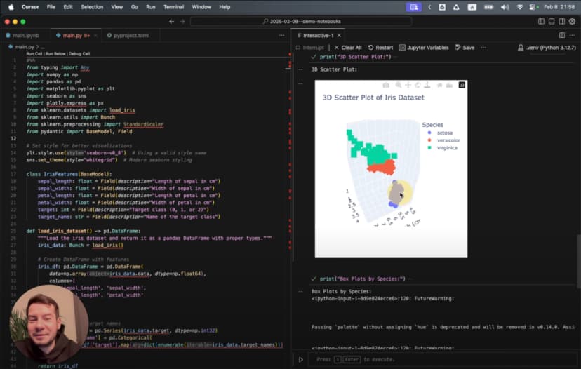
Visualization ke liye jab maine ye prompt diya:
Generate a 3D scatter plot for the iris dataset showing the three species in different colors
AI ne ek sophisticated 3D visualization generate ki:
# %%
# Create 3D scatter plot
from mpl_toolkits.mplot3d import Axes3D

# Create figure and 3D axis
fig = plt.figure(figsize=(10, 8))
ax = fig.add_subplot(111, projection='3d')

# Get the three species
species_names = iris.target_names
colors = ['blue', 'red', 'green']

# Plot each species with a different color
for species_id, species_name in enumerate(species_names):
    # Filter data for this species
    species_data = df[df['species'] == species_id]

    # Plot this species
    ax.scatter(
        species_data['sepal length (cm)'],
        species_data['sepal width (cm)'],
        species_data['petal length (cm)'],
        c=colors[species_id],
        label=species_name,
        s=60,
        alpha=0.8
    )

# Set labels and title
ax.set_xlabel('Sepal Length (cm)')
ax.set_ylabel('Sepal Width (cm)')
ax.set_zlabel('Petal Length (cm)')
ax.set_title('3D Scatter Plot of Iris Dataset')
ax.legend()

# Add rotation for better visualization
for angle in range(0, 360, 5):
    ax.view_init(30, angle)
    plt.draw()
    plt.pause(0.001)

plt.show()
Ye sirf simple chart nahi hai. Ye animated 3D visualization hai jo data ko alag-alag angles se dikhati hai.
Better code generation ke liye Cursor Rules
Maine discover kiya ki main .cursorrules file add karke AI ko aur useful bana sakta hoon. Ye file project root me rehti hai aur batati hai ki AI ko code kis style me generate karna chahiye.
Cursor rules ko effectively use karne ke liye meri detailed guide yahan mil jayegi.
Example ke liye maine ye rules add kiye:
<cursorrules_code_style>
- Prefer functional programming over OOP
- Use pure functions with clear input/output
- Use strict typing for all variables and functions
</cursorrules_code_style>

<cursorrules_python_specifics>
- Prefer Pydantic over TypedDict for data models
- Use pyproject.toml over requirements.txt
- For complex structures, avoid generic collections
</cursorrules_python_specifics>
In rules ke baad AI ne zyada type-safe aur meri preferred style ka code generate karna shuru kiya:
# %%
# Define a Pydantic model for better type safety
from pydantic import BaseModel
from typing import List, Optional

class IrisFeatures(BaseModel):
    sepal_length: float
    sepal_width: float
    petal_length: float
    petal_width: float
    species: int
    species_name: Optional[str] = None

# Function to convert DataFrame rows to Pydantic models
def convert_to_models(df: pd.DataFrame) -> List[IrisFeatures]:
    species_map = {0: "setosa", 1: "versicolor", 2: "virginica"}

    return [
        IrisFeatures(
            sepal_length=row["sepal length (cm)"],
            sepal_width=row["sepal width (cm)"],
            petal_length=row["petal length (cm)"],
            petal_width=row["petal width (cm)"],
            species=row["species"],
            species_name=species_map[row["species"]]
        )
        for _, row in df.iterrows()
    ]

# Convert a sample for demonstration
iris_models = convert_to_models(df.head())
for model in iris_models:
    print(model)
Iris dataset explore karna
Environment ready hai aur AI assistant bhi तैयार hai, to ab actual analysis shuru karte hain.
Data ko pehli baar dekhna
Dataset load ho chuka hai. Ab uska structure dekhte hain:
# %%
# Get basic information about the dataset
print("Dataset shape:", df.shape)
print("\nClass distribution:")
print(df['species'].value_counts())

# Create a more readable species column
species_names = {0: 'setosa', 1: 'versicolor', 2: 'virginica'}
df['species_name'] = df['species'].map(species_names)

# Display descriptive statistics
print("\nDescriptive statistics:")
print(df.describe())
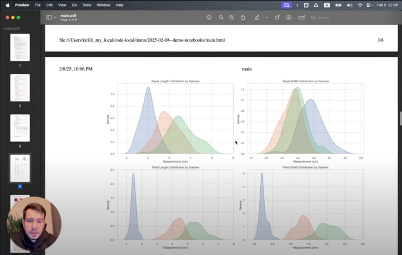
Ye batata hai ki dataset me 150 samples hain, har species ke 50, aur 4 features hain. Ab in features ko visualize karte hain:
# %%
# Create boxplots for each feature by species
plt.figure(figsize=(12, 10))

for i, feature in enumerate(iris.feature_names):
    plt.subplot(2, 2, i+1)
    sns.boxplot(x='species_name', y=feature, data=df)
    plt.title(f'Distribution of {feature} by Species')
    plt.xticks(rotation=45)

plt.tight_layout()
plt.show()
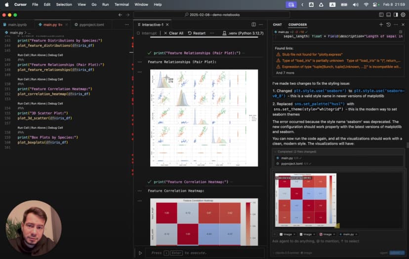
Boxplots se clear patterns milte hain: Setosa ke sepals relatively wide hain, aur Virginica ke petals sabse bade hain.
Hidden patterns dhoondhna
Features ke relationships dekhne ke liye:
# %%
# Create a pairplot to visualize relationships between features
sns.pairplot(df, hue='species_name', height=2.5)
plt.suptitle('Iris Dataset Pairwise Relationships', y=1.02)
plt.show()
Is pairplot se turant samajh aata hai:
- Petal measurements aane par Setosa clearly alag hoti hai
- Versicolor aur Virginica me kuch overlap hai
- Petal length aur width sabse clear separation deti hain
Advanced analysis ke liye scikit-learn User Guide useful resource hai.
Dependency issues aur troubleshooting
Jab maine thodi complex visualizations banani shuru ki, mujhe Seaborn ke saath ye error mila:
ImportError: Seaborn not valid package style
Data science libraries me version incompatibility common hoti hai. Diagnose karne ke liye maine installed versions check ki:
# %%
# Check installed package versions
import pkg_resources
print("Installed packages:")
for package in ['numpy', 'pandas', 'matplotlib', 'seaborn', 'scikit-learn']:
    try:
        version = pkg_resources.get_distribution(package).version
        print(f"{package}: {version}")
    except pkg_resources.DistributionNotFound:
        print(f"{package}: Not installed")
Pata chala Seaborn aur NumPy versions incompatible the. Solution simple tha:
- Bottom panel me terminal icon par click karein
- “Pop out terminal” select karein
- Run karein:
pip install seaborn --upgrade
Yahan Cursor IDE ki strength saamne aati hai: dependency fix karne ke liye tool switch nahi karna padta.
Better visualizations banana
Environment sahi chalne ke baad maine aise charts banana chaha jo data ke patterns ko clearly reveal kar sakein.
Simple charts se 3D visualizations tak
Maine petal dimensions ke simple scatter plot se start kiya:
# %%
# Create a scatter plot of petal dimensions
plt.figure(figsize=(10, 6))
for species_id, species_name in enumerate(iris.target_names):
    species_data = df[df['species'] == species_id]
    plt.scatter(
        species_data['petal length (cm)'],
        species_data['petal width (cm)'],
        label=species_name,
        alpha=0.7,
        s=70
    )

plt.title('Petal Dimensions by Species')
plt.xlabel('Petal Length (cm)')
plt.ylabel('Petal Width (cm)')
plt.legend()
plt.grid(True, alpha=0.3)
plt.show()
Is plot me Setosa neeche left side par tight cluster banati dikhti hai.
Phir maine correlation heatmap banaya:
# %%
# Calculate correlation matrix
correlation_matrix = df.drop(columns=['species_name']).corr()

# Create a heatmap
plt.figure(figsize=(10, 8))
sns.heatmap(
    correlation_matrix,
    annot=True,
    cmap='coolwarm',
    linewidths=0.5,
    vmin=-1,
    vmax=1
)
plt.title('Correlation Matrix of Iris Features')
plt.show()
Heatmap ne dikhaya ki petal length aur petal width ke beech 0.96 ka strong correlation hai.
Lekin sabse impressive visualization wahi rotating 3D scatter plot thi. Different angles par species clusters bahut clearly dikhne lagte hain.
Findings share karna: analysis se presentation tak
Insights milne ke baad mujhe unhe un colleagues ke saath share karna tha jinke paas Python ya Jupyter installed nahi tha. Yahan export capabilities kaafi useful hain.
Professional reports banana
Shareable report banane ke liye:
- Main ensure karta hoon ki sab cells execute ho chuke hon
- Methodology aur findings explain karne ke liye markdown cells add karta hoon
- “Export as HTML” use karta hoon
- Browser me HTML khol kar “Save as PDF” karta hoon
Result ek aisa report hota hai jisme code, explanations aur visualizations sab hote hain. Presentation quality ke liye main often ye use karta hoon:
plt.figure(figsize=(10, 6), dpi=300)
3D visualizations ke case me main export se pehle sabse informative angle choose karta hoon.
Workflow transformation
Peechhe mudkar dekho to transformation kaafi clear hai. Jo kaam pehle teen alag tools aur constant context switching me hota tha, woh ab ek hi environment me hota hai:
- Explore: AI ki help se data load aur initial visualizations
- Discover: Jupyter cells ke saath analysis refine karna
- Document: Findings ko code ke saath hi likhna
- Share: Final analysis ko report ke roop me export karna
Jupyter ki interactivity, Cursor IDE ki editing power, aur AI assistance ka combination friction ko kaafi kam kar deta hai.
Ek aur bonus hai: kyunki main original .ipynb ke bajay plain text files use kar raha hoon, mera analysis git me properly version-controlled hota hai.
Comparison: traditional Jupyter vs LLM-enhanced Cursor IDE
Yeh quick comparison key differences ko summarize karta hai:
| Feature | Traditional Jupyter Notebooks | Cursor IDE with Plain Text Jupyter |
|---|---|---|
| File Format | Complex JSON (.ipynb) | Plain text Python (.py) |
| Version Control | Difficult (large diffs, merge conflicts) | Excellent (standard git workflow) |
| IDE Features | Limited code navigation and refactoring | Full IDE capabilities (search, replace, navigation) |
| AI Assistance | Limited | Powerful LLM integration with context awareness |
| Cell Execution | Browser-based interface | Native IDE environment |
| Context Switching | Required for advanced editing | Everything in one environment |
| Performance | Can be slow with large notebooks | Native editor performance |
| Debugging | Limited debugging capabilities | Full IDE debugging tools |
| Export Options | HTML, PDF, various formats | Same capabilities through extension |
| Collaboration | Challenging with version control | Standard code collaboration workflows |
| Dependencies | Managed in separate environment files | Integrated environment management |
| Hidden State Issues | Common problem with out-of-order execution | Reduced by linear execution encouragement |
| Markdown Support | Native | Through cell markers with same capabilities |
| Typechecking | None | Full IDE static analysis support |
| Extension Ecosystem | Jupyter extensions | IDE extensions + Jupyter extensions |
Isi wajah se mujhe lagta hai ki serious data analysis work ke liye Cursor IDE approach kaafi zyada practical hai.
Jupyter architecture aur ecosystem ke liye Project Jupyter Documentation dekhen.
Video tutorial
Agar aap visual learning prefer karte hain, to maine ek detailed video tutorial bhi banaya hai:

Video me Cursor IDE me Jupyter notebooks setup karna, AI integration use karna, visualizations banana aur results export karna sab kuch real-time dikhaya gaya hai.