从崩溃到流畅:我在 Cursor IDE 中结合 Jupyter Notebooks 与 LLM 的工作流
问题:LLM 和 Jupyter Notebooks 天生不太合拍
那天凌晨两点,我终于承认自己搞不定了。我的基因测序分析卡住了,因为 Cursor IDE 里的 LLM 助手没办法稳定解析 Jupyter notebook 那套复杂的 JSON 结构。每次我试图让 AI 帮我改可视化代码,最后得到的都是坏掉的 JSON,连文件都打不开。我也试过只贴代码片段,但那样又丢掉了数据预处理的上下文。与此同时,我桌面上一直开着三个窗口: 浏览器里的 Jupyter、用来“认真写代码”的 VSCode,以及另一个写文档的编辑器。Jupyter 格式和 LLM 的不兼容,再加上不断切换上下文,让复杂数据工作变得非常痛苦。就连 Iris 这种简单基准数据集,这个根本性问题也一样在拖慢我。
听起来熟悉吗?数据科学工作流在上下文切换这件事上尤其折磨人。你会不停在下面这些工具间来回跳:
- 写“正式代码”的编辑器
- 用于探索的 Jupyter notebook
- 用来整理分享结论的文档工具
- 画图用的可视化软件
- 浏览器里打开的 ChatGPT 和 Claude
每一次切换都会消耗宝贵的脑力,也会给探索过程增加摩擦。但如果有一种更好的方法呢?
更喜欢视频教程? 我录了整套流程的分步视频演示。观看 Jupyter Notebooks in Cursor IDE Tutorial with AI-Powered Data Analysis,直接看这些技巧怎么实际工作。
发现:在 Cursor IDE 中把数据科学工作流统一起来
后来我撞见了一个彻底改变工作流的方案:直接在 Cursor IDE 里使用 Jupyter notebook,再叠加 AI 的能力。这个做法把几件重要的东西合在了一起:
- Jupyter 基于 cell 的交互式执行
- 真正 IDE 才有的编辑、导航和重构能力
- 能理解代码也能理解数据分析语境的 AI 助手
- 对版本控制更友好的纯文本文件格式
看完这篇文章后,你会看到我怎样搭出一个统一环境,让我能够:
- 用很少的手写代码分析数据并生成可视化
- 做出能揭示隐藏模式的 3D 图表
- 把发现直接写在代码旁边
- 用一条命令导出专业级报告
- 全程不再频繁切换工具
如果你也受够了不断切换工具,那我们开始吧。
在 Cursor IDE 中准备 Jupyter 环境
每段冒险都需要准备工作。要在 Cursor IDE 里顺利用 Jupyter,我们需要先装对工具、配好环境。
安装 Jupyter 扩展
魔法从 Cursor IDE 的 Jupyter 扩展开始:
- 打开 Cursor IDE,创建项目目录
- 进入侧边栏的 Extensions
- 搜索 “Jupyter”,找到官方扩展
- 点击 “Install”
这个扩展是传统 notebook 和 IDE 之间的桥梁。它带来一个很关键的能力:你可以在普通 Python 文件里用特殊标记创建可执行 cell。也就是说,不再需要结构复杂的 .ipynb 文件,而是可以直接用纯文本 Python 文件加上少量标记。
如果你想了解 Jupyter Notebook 本身的能力,可以看 官方文档。
准备 Python 环境
扩展装好之后,下一步是准备一个干净的 Python 环境:
python -m venv .venv
接着创建一个 pyproject.toml 来管理依赖:
[build-system]
requires = ["setuptools>=42.0", "wheel"]
build-backend = "setuptools.build_meta"

[project]
name = "jupyter-cursor-project"
version = "0.1.0"
description = "Data analysis with Jupyter in Cursor IDE"

[tool.poetry.dependencies]
python = "^3.9"
jupyter = "^1.0.0"
pandas = "^2.1.0"
numpy = "^1.25.0"
matplotlib = "^3.8.0"
seaborn = "^0.13.0"
scikit-learn = "^1.2.0"
然后安装依赖:
pip install -e .
我也是踩坑之后才学会的:版本冲突会带来很诡异的报错。只要 AI 给你生成了导入某个库的代码,就先确认那个库真的安装在当前环境里。
创建第一个 Notebook:纯文本的力量
传统 Jupyter notebook 使用 .ipynb 格式,本质上是一个复杂 JSON。它既不适合直接编辑,也很难让 AI 在不弄坏结构的前提下修改。相比之下,我们可以用一种更适合 LLM 的纯文本方式,同时保留 notebook 的交互式体验。
原始 Jupyter Notebook 的问题
下面是一个传统 .ipynb 文件在文本编辑器里长什么样:
{
  "cells": [
    {
      "cell_type": "markdown",
      "metadata": {},
      "source": [
        "# My Notebook Title\n",
        "This is a markdown cell with text."
      ]
    },
    {
      "cell_type": "code",
      "execution_count": 1,
      "metadata": {},
      "outputs": [
        {
          "name": "stdout",
          "output_type": "stream",
          "text": ["Hello, world!"]
        }
      ],
      "source": [
        "print(\"Hello, world!\")"
      ]
    }
  ],
  "metadata": {
    "kernelspec": {
      "display_name": "Python 3",
      "language": "python",
      "name": "python3"
    }
  },
  "nbformat": 4,
  "nbformat_minor": 4
}
这类结构对 LLM 来说尤其难处理,原因包括:
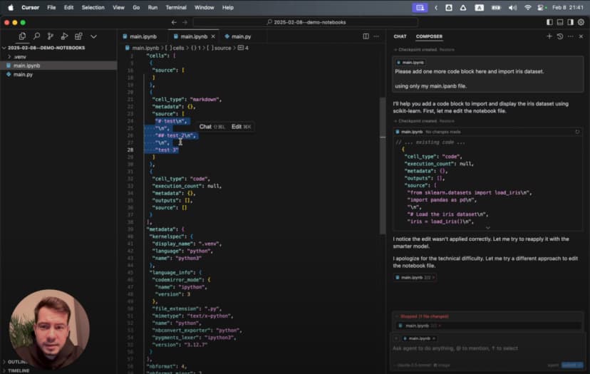
- JSON 里充满与内容本身无关的符号和嵌套层级
- 每个 cell 的内容是字符串数组,并带换行和引号转义
- 代码和输出分散在不同位置
- 想做一个小修改,都得理解整套 JSON schema
- 内容稍微改一点,整个 diff 就可能变得很大
所以 LLM 很容易在修改过程中把结构弄坏,最后生成无法打开的 notebook。
Cell 标记的魔法
创建一个 main.py 文件,加入第一个 cell:
# %%
# Import necessary libraries
import pandas as pd
import numpy as np
import matplotlib.pyplot as plt
import seaborn as sns

# Display settings for better visualization
pd.set_option('display.max_columns', None)
plt.style.use('ggplot')

print("Environment ready for data analysis!")
看到最上面的 # %% 了吗?它就是关键标记。Jupyter 扩展会把它识别成一个代码 cell。加上这个标记后,编辑器旁边会出现运行按钮,你可以只执行这一段,输出直接显示在编辑器里。
接着再加一个 markdown cell:
# %% [markdown]
"""
# Iris Dataset Analysis

This notebook explores the famous Iris flower dataset to understand:
- The relationships between different flower measurements
- How these measurements can distinguish between species
- Which features provide the best separation between species

Each flower in the dataset belongs to one of three species:
1. Setosa
2. Versicolor
3. Virginica
"""
这里的组合非常强: 可执行代码和完整文档都在同一个纯文本文件里。没有特殊格式,也没有浏览器编辑的限制,对版本控制也非常友好。
在后面的 notebook 里,我会遵循这样的结构:
- 用
# %%写代码 cell - 用
# %% [markdown]和三引号写说明 - 按照“载入数据 → 探索 → 可视化”的顺序组织
- 把过程和发现直接写在文件里
释放 LLM 助手:让 AI 成为你的数据科学搭档
真正让这套工作流发生质变的,是它和 Cursor AI Composer 的结合。它不只是自动补全,而更像一个能合作的搭档。
Agent Mode:AI 数据分析伙伴
在 Cursor IDE 中点击 “Composer”,再切换到 “Agent Mode”。这会启用一个更强的 AI 助手,它可以:
- 在多轮交互中保持上下文
- 理解你的数据集和分析目标
- 直接生成符合 Jupyter 语法的完整代码 cell
- 生成贴合你数据的可视化
先让它导入一个数据集:
Please import the Iris dataset in this notebook format
AI 会生成一个完整可执行的 cell:
# %%
# Import necessary libraries
import pandas as pd
import numpy as np
import matplotlib.pyplot as plt
from sklearn.datasets import load_iris

# Load the Iris dataset
iris = load_iris()

# Convert to pandas DataFrame
df = pd.DataFrame(data=iris.data, columns=iris.feature_names)
df['species'] = iris.target

# Display the first few rows
print(df.head())
只是一句提示词,就得到一个排版正确、能直接运行的 cell。你不需要去记住每一个函数名和参数。
更有意思的是,当我让它生成可视化时:
Generate a 3D scatter plot for the iris dataset showing the three species in different colors
AI 会生成一个带旋转效果的 3D 可视化:
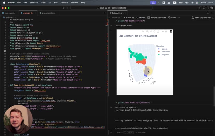
# %%
# Create 3D scatter plot
from mpl_toolkits.mplot3d import Axes3D

# Create figure and 3D axis
fig = plt.figure(figsize=(10, 8))
ax = fig.add_subplot(111, projection='3d')

# Get the three species
species_names = iris.target_names
colors = ['blue', 'red', 'green']

# Plot each species with a different color
for species_id, species_name in enumerate(species_names):
    # Filter data for this species
    species_data = df[df['species'] == species_id]

    # Plot this species
    ax.scatter(
        species_data['sepal length (cm)'],
        species_data['sepal width (cm)'],
        species_data['petal length (cm)'],
        c=colors[species_id],
        label=species_name,
        s=60,
        alpha=0.8
    )

# Set labels and title
ax.set_xlabel('Sepal Length (cm)')
ax.set_ylabel('Sepal Width (cm)')
ax.set_zlabel('Petal Length (cm)')
ax.set_title('3D Scatter Plot of Iris Dataset')
ax.legend()

# Add rotation for better visualization
for angle in range(0, 360, 5):
    ax.view_init(30, angle)
    plt.draw()
    plt.pause(0.001)

plt.show()
这已经不是一个简单图表,而是一个能从多个角度观察数据的动画 3D 散点图,而且标签、颜色、格式都已经处理好了。
用 Cursor Rules 引导 LLM 生成更好的代码
后来我发现,还可以通过在项目根目录创建 .cursorrules 文件,让 AI 生成的代码更贴近我的偏好。这个文件本质上就是告诉模型,我希望它按什么方式写代码。
如果你想系统了解 Cursor rules,可以看我另一篇关于 如何优化 Cursor AI 编码规则 的文章。
例如,我加入了这样的规则:
<cursorrules_code_style>
- Prefer functional programming over OOP
- Use pure functions with clear input/output
- Use strict typing for all variables and functions
</cursorrules_code_style>

<cursorrules_python_specifics>
- Prefer Pydantic over TypedDict for data models
- Use pyproject.toml over requirements.txt
- For complex structures, avoid generic collections
</cursorrules_python_specifics>
加上这些规则之后,AI 开始稳定生成更符合我偏好的类型安全代码:
# %%
# Define a Pydantic model for better type safety
from pydantic import BaseModel
from typing import List, Optional

class IrisFeatures(BaseModel):
    sepal_length: float
    sepal_width: float
    petal_length: float
    petal_width: float
    species: int
    species_name: Optional[str] = None

# Function to convert DataFrame rows to Pydantic models
def convert_to_models(df: pd.DataFrame) -> List[IrisFeatures]:
    species_map = {0: "setosa", 1: "versicolor", 2: "virginica"}

    return [
        IrisFeatures(
            sepal_length=row["sepal length (cm)"],
            sepal_width=row["sepal width (cm)"],
            petal_length=row["petal length (cm)"],
            petal_width=row["petal width (cm)"],
            species=row["species"],
            species_name=species_map[row["species"]]
        )
        for _, row in df.iterrows()
    ]

# Convert a sample for demonstration
iris_models = convert_to_models(df.head())
for model in iris_models:
    print(model)
模型基本完全按照规则来写:类型更清晰、代码风格更一致,也更接近我想要的函数式方向。
探索 Iris 数据集:开始真正的数据分析
环境准备好、AI 助手也就位后,就可以真正开始分析经典的 Iris 数据集了。
先看看数据本身
数据已经加载好了,先看结构:
# %%
# Get basic information about the dataset
print("Dataset shape:", df.shape)
print("\nClass distribution:")
print(df['species'].value_counts())

# Create a more readable species column
species_names = {0: 'setosa', 1: 'versicolor', 2: 'virginica'}
df['species_name'] = df['species'].map(species_names)

# Display descriptive statistics
print("\nDescriptive statistics:")
print(df.describe())
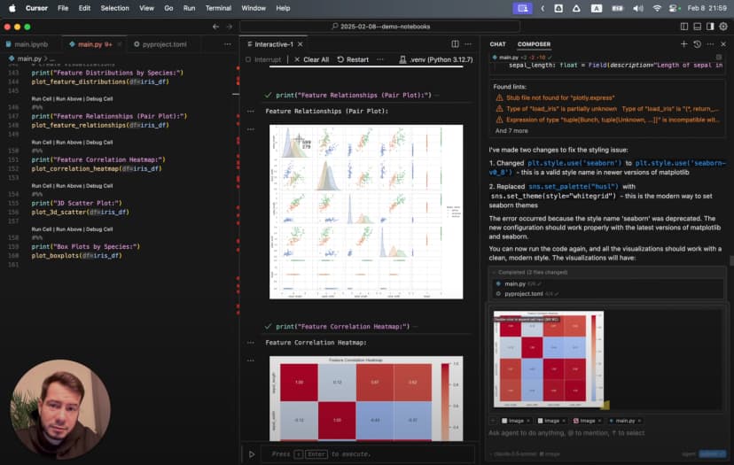
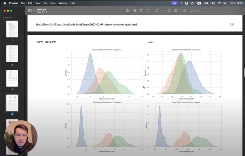
这告诉我们数据集有 150 条样本,每个物种 50 条,一共有 4 个花朵特征。接着我用 boxplot 看不同物种的分布差异:
# %%
# Create boxplots for each feature by species
plt.figure(figsize=(12, 10))

for i, feature in enumerate(iris.feature_names):
    plt.subplot(2, 2, i+1)
    sns.boxplot(x='species_name', y=feature, data=df)
    plt.title(f'Distribution of {feature} by Species')
    plt.xticks(rotation=45)

plt.tight_layout()
plt.show()
这些图很快揭示出几个明显模式:Setosa 的花萼更宽但花瓣更小,Virginica 的花瓣整体最大。那到底哪些特征最能区分不同物种?
找出隐藏模式
为了回答这个问题,我们需要看特征之间的关系:
# %%
# Create a pairplot to visualize relationships between features
sns.pairplot(df, hue='species_name', height=2.5)
plt.suptitle('Iris Dataset Pairwise Relationships', y=1.02)
plt.show()
这个 pairplot 非常直观,它一次性展示了所有特征两两之间的关系,而且按物种着色。你可以立刻看到:
- 只要图里包含花瓣相关特征,Setosa 基本都和其他两类完全分开
- Versicolor 和 Virginica 有一定重叠,但仍然能区分
- 花瓣长度和宽度是区分三类物种最有效的特征
如果想看更深入的数据分析与可视化方法,可以参考 scikit-learn User Guide。
解决 Jupyter 集成中的障碍:依赖问题排查
任何工作流升级都会遇到坑。我在做更复杂的可视化时,就遇到了 Seaborn 导入报错:
ImportError: Seaborn not valid package style
这是数据科学环境里很常见的问题:包版本不兼容。为了定位问题,我又加了一个 cell 来检查当前环境中的版本:
# %%
# Check installed package versions
import pkg_resources
print("Installed packages:")
for package in ['numpy', 'pandas', 'matplotlib', 'seaborn', 'scikit-learn']:
    try:
        version = pkg_resources.get_distribution(package).version
        print(f"{package}: {version}")
    except pkg_resources.DistributionNotFound:
        print(f"{package}: Not installed")
最后我发现是 Seaborn 和 NumPy 版本不兼容。解决办法也很直接,使用 Cursor 的弹出终端:
- 点击底部面板的终端图标
- 选择 “Pop out terminal”
- 执行更新命令:
pip install seaborn --upgrade
这里正是 Cursor IDE 的优势所在:我不需要切换工具,也不用离开分析上下文,就能直接修好依赖问题。
更好的是,我还可以把错误信息直接丢给 AI,它通常会给出非常接近正确答案的修复命令。弹出终端 + AI 助手的组合,让排障速度明显快了很多。
做出真正有洞察的可视化
环境稳定之后,我想做一些不只是“能画出来”,而是真的能帮助理解数据模式的图表。
从简单图表到 3D 可视化
我先从花瓣尺寸的散点图开始:
# %%
# Create a scatter plot of petal dimensions
plt.figure(figsize=(10, 6))
for species_id, species_name in enumerate(iris.target_names):
    species_data = df[df['species'] == species_id]
    plt.scatter(
        species_data['petal length (cm)'],
        species_data['petal width (cm)'],
        label=species_name,
        alpha=0.7,
        s=70
    )

plt.title('Petal Dimensions by Species')
plt.xlabel('Petal Length (cm)')
plt.ylabel('Petal Width (cm)')
plt.legend()
plt.grid(True, alpha=0.3)
plt.show()
这个图很快就能看出 Setosa 在左下角形成了一个非常紧的簇。
然后我又画了相关性热力图:
# %%
# Calculate correlation matrix
correlation_matrix = df.drop(columns=['species_name']).corr()

# Create a heatmap
plt.figure(figsize=(10, 8))
sns.heatmap(
    correlation_matrix,
    annot=True,
    cmap='coolwarm',
    linewidths=0.5,
    vmin=-1,
    vmax=1
)
plt.title('Correlation Matrix of Iris Features')
plt.show()
热力图显示花瓣长度和花瓣宽度有很强的相关性,相关系数达到 0.96。
不过最令人印象深刻的仍然是前面那张旋转 3D 散点图。它在不同视角下会出现几个“刚好完全分开”的角度,让你看见静态二维图难以察觉的模式。
这就是交互式数据可视化的价值:它把抽象数字变成直观感受。
分享分析结果:从探索到展示
当我得到这些结论之后,下一步就是把结果分享给没有 Python 或 Jupyter 环境的同事。这时 Jupyter 扩展的导出能力就非常重要。
生成专业报告
为了生成可分享的报告,我会这样做:
- 确认所有 cell 都已经执行过,输出都可见
- 增加 markdown cell,解释方法和结论
- 使用 Jupyter 扩展的 “Export as HTML”
- 在浏览器中打开导出的 HTML,再用 “Save as PDF”
最终生成的报告会包含代码、文字说明和可视化,而且任何人都可以直接查看。因为前面在 markdown 上做了整齐排版,所以标题、列表、强调样式在导出后依然保持得很好。
如果我要把报告发给非技术背景的人看,我通常会把图表尺寸设得更适合展示,比如:
plt.figure(figsize=(10, 6), dpi=300)
这样导出的 PDF 更清晰,也更适合打印。
至于 3D 图,我会在导出之前先把视角停在最能说明问题的角度,因为 PDF 里最终只能保留静态画面。
工作流的变化:在 Cursor IDE 中做 LLM 加持的数据分析
回头看,这个变化其实很大。以前我要在三个工具之间来回切换,现在整个流程都能在一个环境里完成:
- Explore: 用 AI 帮我载入数据、搭出初始可视化
- Discover: 用 Jupyter 的 cell 执行方式不断细化分析
- Document: 直接把结论写在代码旁边
- Share: 用一条导出命令生成完整报告
Jupyter 的交互性、Cursor IDE 的编辑能力,以及 AI 助手三者结合之后,原本频繁打断专注的摩擦几乎都消失了。
还有一个额外好处:因为我用的是纯文本文件,而不是原始 .ipynb,整个分析过程终于能被 Git 正常管理。我可以清楚看到版本之间到底改了什么,也能避免 notebook 常见的合并冲突。
这种方式不只是节省时间,它实际上改变了我做数据分析的方式。因为不再被不断切换工具打断,我能更长时间保持 flow state,让探索顺着洞察自然往前走。
如果你也厌倦了为数据工作同时管理一堆工具,我很建议你试试这个集成方案。在 Cursor IDE 中配置好 Jupyter,用上 AI 助手,再体验一次真正顺畅的统一工作流。
对比:传统 Jupyter 与 LLM 增强的 Cursor IDE
下面这张表可以快速总结两种方式的差别:
| Feature | Traditional Jupyter Notebooks | Cursor IDE with Plain Text Jupyter |
|---|---|---|
| File Format | Complex JSON (.ipynb) | Plain text Python (.py) |
| Version Control | Difficult (large diffs, merge conflicts) | Excellent (standard git workflow) |
| IDE Features | Limited code navigation and refactoring | Full IDE capabilities (search, replace, navigation) |
| AI Assistance | Limited | Powerful LLM integration with context awareness |
| Cell Execution | Browser-based interface | Native IDE environment |
| Context Switching | Required for advanced editing | Everything in one environment |
| Performance | Can be slow with large notebooks | Native editor performance |
| Debugging | Limited debugging capabilities | Full IDE debugging tools |
| Export Options | HTML, PDF, various formats | Same capabilities through extension |
| Collaboration | Challenging with version control | Standard code collaboration workflows |
| Dependencies | Managed in separate environment files | Integrated environment management |
| Hidden State Issues | Common problem with out-of-order execution | Reduced by linear execution encouragement |
| Markdown Support | Native | Through cell markers with same capabilities |
| Typechecking | None | Full IDE static analysis support |
| Extension Ecosystem | Jupyter extensions | IDE extensions + Jupyter extensions |
这也是为什么我觉得 Cursor IDE 的做法更适合严肃的数据分析工作,尤其是在 AI 已经加入工作流之后。
如果你想更深入了解 Jupyter 整个生态的架构,可以看 Project Jupyter Documentation。
视频教程:完整观看 Jupyter + Cursor IDE 工作流
如果你更喜欢视频形式,我也做了一个完整教程,覆盖本文中的所有内容:

视频中会逐步展示如何在 Cursor IDE 中设置并使用 Jupyter notebooks、AI 集成如何工作、如何生成可视化,以及如何导出结果,同时全程保持在一个统一环境里。