From Frustration to Flow: My LLM-Powered Journey with Jupyter Notebooks and AI in Cursor IDE
The Problem: LLMs and Jupyter Notebooks Don't Play Well Together
It was 2 AM when I finally admitted defeat. My genomic sequencing analysis was stalled because my LLM assistant in Cursor IDE couldn't effectively parse the complex JSON structure of my Jupyter notebook. Every attempt to get AI help with my visualization code resulted in broken JSON that wouldn't even load. I tried sending snippets instead, but that stripped away all the context about my preprocessing steps. Meanwhile, I had three different windows open—Jupyter in the browser, VSCode for "real" coding, and another editor for documentation. The combination of LLM limitations with Jupyter's format and constant context switching made complex data work nearly impossible. Even for simpler benchmark datasets like Iris, this fundamental incompatibility was killing my productivity.
Sound familiar? Data science workflows can be especially brutal for context switching. You're constantly bouncing between:
- Code editors for "serious" programming
- Jupyter notebooks for exploration
- Documentation tools for sharing findings
- Visualization software for creating charts
- Opened chatGPT and Claude in browser to ask questions
Each switch costs precious mental energy and introduces friction that slows down discovery. But what if there was a better way?
Prefer Video Tutorial? I've created a step-by-step video demonstration of this entire workflow. Watch Jupyter Notebooks in Cursor IDE Tutorial with AI-Powered Data Analysis to see these techniques in action.
The Discovery: Unified Data Science with LLMs in Cursor IDE
That's when I stumbled upon a solution that transformed my workflow: using Jupyter notebooks directly within Cursor IDE, enhanced by the power of AI. This approach combines:
- The interactive cell-based execution of Jupyter
- The powerful editing and navigation features of a proper IDE
- AI assistance that understands both code and data science concepts
- Plain text file formats that work beautifully with version control
By the end of this article, I'll show you how I built an integrated environment that allows me to:
- Analyze datasets and generate visualizations with minimal coding
- Create stunning 3D visualizations that reveal hidden patterns in data
- Document my findings alongside my code in an elegant format
- Export professional-quality reports with a single command
- Accomplish all of this without switching between different tools
Ready to end the context-switching madness? Let's begin our journey.
Setting Up Your Jupyter Environment in Cursor IDE: The Foundation
Every adventure needs preparation. To set up Jupyter in Cursor IDE, we need to install the right tools and configure our environment.
Installing the Jupyter Extension
The magic starts with the Jupyter extension for Cursor IDE:
- Open Cursor IDE and create a project folder
- Navigate to Extensions in the sidebar
- Search for "Jupyter" and find the official extension (with millions of downloads)
- Click "Install"
This extension is the bridge between traditional notebooks and your IDE. It enables a revolutionary feature: the ability to use special syntax markers in regular Python files to create executable cells. No more .ipynb files with complex JSON structures—just plain text Python with some special markers.
For more information about Jupyter Notebooks and their capabilities, check out the official Jupyter Notebook documentation, which provides a comprehensive guide to their features and usage.
Preparing Your Python Environment
With the extension installed, let's set up a proper Python environment:
python -m venv .venv
Next, create a pyproject.toml file to manage dependencies:
[build-system]
requires = ["setuptools>=42.0", "wheel"]
build-backend = "setuptools.build_meta"

[project]
name = "jupyter-cursor-project"
version = "0.1.0"
description = "Data analysis with Jupyter in Cursor IDE"

[tool.poetry.dependencies]
python = "^3.9"
jupyter = "^1.0.0"
pandas = "^2.1.0"
numpy = "^1.25.0"
matplotlib = "^3.8.0"
seaborn = "^0.13.0"
scikit-learn = "^1.2.0"
Install these dependencies in your virtual environment:
pip install -e .
I learned the hard way that version conflicts can cause mysterious errors. When the AI suggests code that imports libraries, always verify they're installed in your environment first.
Creating Your First Notebook: Plain Text Power
Traditional Jupyter notebooks use the .ipynb format—a complex JSON structure that's difficult to edit directly and nearly impossible for AI tools to modify without breaking. Instead, we'll use a plain text approach that gives us the best of both worlds.
The Problem with original Jupyter Notebooks
Here's a glimpse of what a traditional .ipynb file actually looks like when you open it in a text editor:
{
  "cells": [
    {
      "cell_type": "markdown",
      "metadata": {},
      "source": [
        "# My Notebook Title\n",
        "This is a markdown cell with text."
      ]
    },
    {
      "cell_type": "code",
      "execution_count": 1,
      "metadata": {},
      "outputs": [
        {
          "name": "stdout",
          "output_type": "stream",
          "text": ["Hello, world!"]
        }
      ],
      "source": [
        "print(\"Hello, world!\")"
      ]
    }
  ],
  "metadata": {
    "kernelspec": {
      "display_name": "Python 3",
      "language": "python",
      "name": "python3"
    }
  },
  "nbformat": 4,
  "nbformat_minor": 4
}
This structure is particularly challenging for LLMs like those used in Cursor's AI features because:
- The JSON format contains numerous symbols and nested structures that aren't directly relevant to the content
- Each cell's content is stored as an array of strings, with special escape characters for newlines and quotes
- Code and its outputs are separated in different parts of the structure
- A simple edit requires understanding the entire JSON schema to avoid breaking the file format
- Small changes to content result in large differences in the JSON, making it hard for AI to generate precise edits
When an LLM tries to modify this format, it often struggles to maintain the correct JSON structure while making meaningful content changes. This results in broken notebooks that won't open or run properly.
The Magic of Cell Markers
Create a file called main.py and let's add our first cell:
# %%
# Import necessary libraries
import pandas as pd
import numpy as np
import matplotlib.pyplot as plt
import seaborn as sns

# Display settings for better visualization
pd.set_option('display.max_columns', None)
plt.style.use('ggplot')

print("Environment ready for data analysis!")
See that # %% at the top? That's the magic marker that tells the Jupyter extension "this is a code cell." When you add this marker, you'll notice run buttons appear next to it. You can execute just this cell, and the results appear directly in your editor.
Let's add a markdown cell for documentation:
# %% [markdown]
"""
# Iris Dataset Analysis

This notebook explores the famous Iris flower dataset to understand:
- The relationships between different flower measurements
- How these measurements can distinguish between species
- Which features provide the best separation between species

Each flower in the dataset belongs to one of three species:
1. Setosa
2. Versicolor
3. Virginica
"""
This is a powerful combination—executable code and rich documentation in the same plain text file. No special file formats, no browser-based editing limitations, just pure text that plays nicely with version control.
As we build our notebook, we'll follow this structure:
- Use
# %%for code cells - Use
# %% [markdown]with triple quotes for documentation - Keep a logical flow from data loading to exploration to visualization
- Document our process and findings along the way
Unleashing the LLM Assistant: Your Data Science Partner
What makes this workflow truly revolutionary is the integration with Cursor's AI Composer. This isn't just autocomplete—it's a collaborative partner that understands data science.
Agent Mode: LLM-Powered Data Science Companion
In Cursor IDE, click on the "Composer" button and select "Agent Mode." This activates a more sophisticated AI assistant that:
- Maintains context across multiple interactions
- Understands your dataset and analysis goals
- Generates complete code cells with proper Jupyter syntax
- Creates visualizations tailored to your specific data
Let's put it to work by asking it to import a dataset:
Please import the Iris dataset in this notebook format
The AI generates a complete, executable cell:
# %%
# Import necessary libraries
import pandas as pd
import numpy as np
import matplotlib.pyplot as plt
from sklearn.datasets import load_iris

# Load the Iris dataset
iris = load_iris()

# Convert to pandas DataFrame
df = pd.DataFrame(data=iris.data, columns=iris.feature_names)
df['species'] = iris.target

# Display the first few rows
print(df.head())
One simple prompt, and we have a perfectly formatted code cell that loads our dataset. No need to remember the exact syntax or function names—the AI handles that for us.
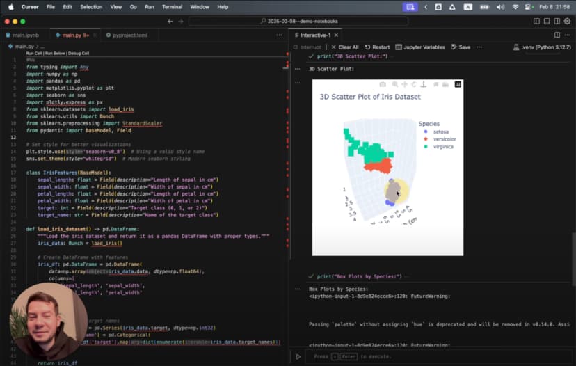
But the real magic happens when we ask for visualizations:
Generate a 3D scatter plot for the iris dataset showing the three species in different colors
The AI creates a sophisticated 3D visualization with rotation:
# %%
# Create 3D scatter plot
from mpl_toolkits.mplot3d import Axes3D

# Create figure and 3D axis
fig = plt.figure(figsize=(10, 8))
ax = fig.add_subplot(111, projection='3d')

# Get the three species
species_names = iris.target_names
colors = ['blue', 'red', 'green']

# Plot each species with a different color
for species_id, species_name in enumerate(species_names):
    # Filter data for this species
    species_data = df[df['species'] == species_id]

    # Plot this species
    ax.scatter(
        species_data['sepal length (cm)'],
        species_data['sepal width (cm)'],
        species_data['petal length (cm)'],
        c=colors[species_id],
        label=species_name,
        s=60,
        alpha=0.8
    )

# Set labels and title
ax.set_xlabel('Sepal Length (cm)')
ax.set_ylabel('Sepal Width (cm)')
ax.set_zlabel('Petal Length (cm)')
ax.set_title('3D Scatter Plot of Iris Dataset')
ax.legend()

# Add rotation for better visualization
for angle in range(0, 360, 5):
    ax.view_init(30, angle)
    plt.draw()
    plt.pause(0.001)

plt.show()
This isn't just a simple chart—it's an animated 3D visualization that rotates to show the data from all angles, with proper labels, colors, and formatting. All from a single prompt.
Guiding the LLM with Cursor Rules for Better Code Generation
I discovered that I could make the AI even more helpful by creating a .cursorrules file in my project root. This file contains custom instructions that guide how the AI generates code.
For a comprehensive guide on setting up and using Cursor rules effectively, check out my detailed article on optimizing AI coding with Cursor rules.
For example, I added these rules:
<cursorrules_code_style>
- Prefer functional programming over OOP
- Use pure functions with clear input/output
- Use strict typing for all variables and functions
</cursorrules_code_style>

<cursorrules_python_specifics>
- Prefer Pydantic over TypedDict for data models
- Use pyproject.toml over requirements.txt
- For complex structures, avoid generic collections
</cursorrules_python_specifics>
With these rules in place, the AI began generating type-safe code that followed my preferred patterns:
# %%
# Define a Pydantic model for better type safety
from pydantic import BaseModel
from typing import List, Optional

class IrisFeatures(BaseModel):
    sepal_length: float
    sepal_width: float
    petal_length: float
    petal_width: float
    species: int
    species_name: Optional[str] = None

# Function to convert DataFrame rows to Pydantic models
def convert_to_models(df: pd.DataFrame) -> List[IrisFeatures]:
    species_map = {0: "setosa", 1: "versicolor", 2: "virginica"}

    return [
        IrisFeatures(
            sepal_length=row["sepal length (cm)"],
            sepal_width=row["sepal width (cm)"],
            petal_length=row["petal length (cm)"],
            petal_width=row["petal width (cm)"],
            species=row["species"],
            species_name=species_map[row["species"]]
        )
        for _, row in df.iterrows()
    ]

# Convert a sample for demonstration
iris_models = convert_to_models(df.head())
for model in iris_models:
    print(model)
The AI followed my rules perfectly, creating well-typed, functional code that used Pydantic models—exactly as I'd requested.
Exploring the Iris Dataset with Python: Our Data Analysis Quest
With our environment set up and AI assistant ready, it's time to begin our expedition into the classic Iris dataset.
First Look at the Data
We already have our dataset loaded, but let's explore its structure:
# %%
# Get basic information about the dataset
print("Dataset shape:", df.shape)
print("\nClass distribution:")
print(df['species'].value_counts())

# Create a more readable species column
species_names = {0: 'setosa', 1: 'versicolor', 2: 'virginica'}
df['species_name'] = df['species'].map(species_names)

# Display descriptive statistics
print("\nDescriptive statistics:")
print(df.describe())
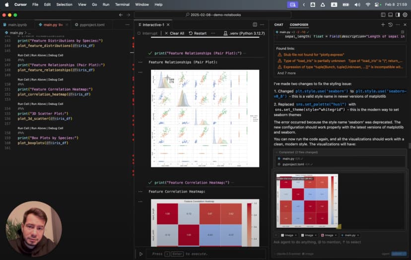
This shows us we have 150 samples (50 of each species) with 4 features measuring different parts of the flowers. Now let's visualize each feature to see how it varies across species:
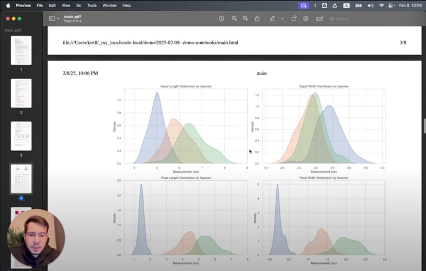
# %%
# Create boxplots for each feature by species
plt.figure(figsize=(12, 10))

for i, feature in enumerate(iris.feature_names):
    plt.subplot(2, 2, i+1)
    sns.boxplot(x='species_name', y=feature, data=df)
    plt.title(f'Distribution of {feature} by Species')
    plt.xticks(rotation=45)

plt.tight_layout()
plt.show()
These boxplots reveal fascinating patterns. Setosa has distinctively wide sepals but small petals. Virginica has the largest petals overall. But which features best distinguish between species?
Uncovering Hidden Patterns
To answer this, we need to look at relationships between features:
# %%
# Create a pairplot to visualize relationships between features
sns.pairplot(df, hue='species_name', height=2.5)
plt.suptitle('Iris Dataset Pairwise Relationships', y=1.02)
plt.show()
This pairplot is a revelation! It shows all possible combinations of features plotted against each other, with points colored by species. We can immediately see that:
- Setosa (blue) is completely separate from the other species in any plot involving petal measurements
- Versicolor and Virginica overlap somewhat but can still be distinguished
- Petal length and width provide the clearest separation between all three species
But the most striking visualization comes from our 3D scatter plot, which shows the three species forming distinct clusters in three-dimensional space. The animation reveals angles where the separation becomes crystal clear—a insight that would be impossible with static 2D plots.
For more advanced visualization and data analysis techniques, you can refer to the excellent scikit-learn User Guide, which provides comprehensive information on machine learning algorithms and data preprocessing methods.
Overcoming Jupyter Integration Obstacles: Troubleshooting Dependencies
Every adventure has its challenges. As I worked with more complex visualizations, I hit a roadblock—an import error with Seaborn:
ImportError: Seaborn not valid package style
This is a common issue with data science libraries: version incompatibilities between packages. To diagnose it, I added a cell to check installed versions:
# %%
# Check installed package versions
import pkg_resources
print("Installed packages:")
for package in ['numpy', 'pandas', 'matplotlib', 'seaborn', 'scikit-learn']:
    try:
        version = pkg_resources.get_distribution(package).version
        print(f"{package}: {version}")
    except pkg_resources.DistributionNotFound:
        print(f"{package}: Not installed")
I discovered my Seaborn version was incompatible with my NumPy version. The solution was to use Cursor's pop-out terminal feature:
- Click on the terminal icon in the bottom panel
- Select "Pop out terminal"
- Run the update command:
pip install seaborn --upgrade
This is where Cursor IDE shines—I could fix the dependency issue without switching tools or losing my place in the analysis.
Even better, I found I could ask the AI for help with my error message, and it suggested the exact command needed to fix it. This combination of the pop-out terminal and AI assistance makes troubleshooting much faster than in traditional environments.
Creating Data Visualization Revelations: Interactive Charts in Jupyter
With our environment working smoothly, I wanted to create visualizations that would truly reveal the patterns in our data.
From Simple Charts to 3D Visualizations
I started with a simple scatter plot focusing on petal dimensions:
# %%
# Create a scatter plot of petal dimensions
plt.figure(figsize=(10, 6))
for species_id, species_name in enumerate(iris.target_names):
    species_data = df[df['species'] == species_id]
    plt.scatter(
        species_data['petal length (cm)'],
        species_data['petal width (cm)'],
        label=species_name,
        alpha=0.7,
        s=70
    )

plt.title('Petal Dimensions by Species')
plt.xlabel('Petal Length (cm)')
plt.ylabel('Petal Width (cm)')
plt.legend()
plt.grid(True, alpha=0.3)
plt.show()
This plot immediately shows how petal measurements separate the species, with Setosa forming a tight cluster in the bottom left.
To understand the relationships more deeply, I created a correlation heatmap:
# %%
# Calculate correlation matrix
correlation_matrix = df.drop(columns=['species_name']).corr()

# Create a heatmap
plt.figure(figsize=(10, 8))
sns.heatmap(
    correlation_matrix,
    annot=True,
    cmap='coolwarm',
    linewidths=0.5,
    vmin=-1,
    vmax=1
)
plt.title('Correlation Matrix of Iris Features')
plt.show()
The heatmap revealed a strong correlation (0.96) between petal length and petal width—these features move together in nature.
But the most remarkable visualization was the animated 3D scatter plot we created earlier. As it rotated through different viewing angles, it showed moments where the three species became perfectly distinct, revealing patterns that would be invisible in static 2D plots.
This is the power of interactive data visualization—it transforms abstract numbers into intuitive, visceral understanding.
Sharing Our Discoveries: From Analysis to Presentation
After uncovering these insights, I needed to share my findings with colleagues who don't have Python or Jupyter installed. This is where the export capabilities of the Jupyter extension become invaluable.
Creating Professional Reports
To create a shareable report:
- I made sure all cells were executed so outputs were visible
- Added markdown cells to explain my methodology and findings
- Used the Jupyter extension's "Export as HTML" option
- Opened the HTML file in a browser and used "Save as PDF" for a polished document
The resulting report contained all my code, text explanations, and visualizations in a format anyone could view. The careful attention to markdown formatting paid off—section headers, bullet points, and emphasis all transferred perfectly to the final document.
For presentations to non-technical stakeholders, I sized visualizations appropriately (usually figsize=(10, 6)) and set high DPI for print quality:
plt.figure(figsize=(10, 6), dpi=300)
This ensured that charts remained crisp and readable in the PDF export.
For the 3D visualizations, I positioned them at their most informative angle before export, knowing that the rotation animation would be captured as a static image. This careful positioning allowed me to highlight the exact pattern I wanted to emphasize in my report.
The Workflow Transformation: LLM-Powered Data Science in Cursor IDE
Looking back at my journey, the transformation is remarkable. What used to take me three separate tools and constant context switching now happens seamlessly in a single environment. My workflow has become:
- Explore: Use AI to help load data and create initial visualizations
- Discover: Leverage Jupyter's cell-based execution to interactively refine my analysis
- Document: Add markdown cells to explain my findings directly alongside the code
- Share: Export the complete analysis as a professional report with a single command
The combination of Jupyter's interactivity, Cursor IDE's powerful editing features, and AI assistance has eliminated the friction that used to break my concentration. I'm free to follow my curiosity without the constant tax of switching between tools.
And there's an unexpected benefit: because I'm using plain text files instead of original Jupyter notebooks, my entire analysis is now properly version-controlled in Git. I can see exactly what changed between versions, collaborate with teammates without merge conflicts, and maintain a clean history of my work.
This approach doesn't just save time—it changes how I think about data analysis. Without the constant interruptions of context switching, I can maintain flow state and follow insights wherever they lead. My analyses are more thorough, my documentation is more complete, and my visualizations are more effective.
If you're tired of juggling multiple tools for data science work, I encourage you to try this integrated approach. Set up Jupyter in Cursor IDE, leverage the AI assistant, and experience the power of a unified workflow. Your future self (especially at 2 AM) will thank you.
Comparison: Traditional Jupyter vs. LLM-Enhanced Cursor IDE
Here's a quick comparison that summarizes the key differences between the traditional Jupyter Notebook approach and the Cursor IDE with plain text Jupyter workflow:
| Feature | Traditional Jupyter Notebooks | Cursor IDE with Plain Text Jupyter |
|---|---|---|
| File Format | Complex JSON (.ipynb) | Plain text Python (.py) |
| Version Control | Difficult (large diffs, merge conflicts) | Excellent (standard git workflow) |
| IDE Features | Limited code navigation and refactoring | Full IDE capabilities (search, replace, navigation) |
| AI Assistance | Limited | Powerful LLM integration with context awareness |
| Cell Execution | Browser-based interface | Native IDE environment |
| Context Switching | Required for advanced editing | Everything in one environment |
| Performance | Can be slow with large notebooks | Native editor performance |
| Debugging | Limited debugging capabilities | Full IDE debugging tools |
| Export Options | HTML, PDF, various formats | Same capabilities through extension |
| Collaboration | Challenging with version control | Standard code collaboration workflows |
| Dependencies | Managed in separate environment files | Integrated environment management |
| Hidden State Issues | Common problem with out-of-order execution | Reduced by linear execution encouragement |
| Markdown Support | Native | Through cell markers with same capabilities |
| Typechecking | None | Full IDE static analysis support |
| Extension Ecosystem | Jupyter extensions | IDE extensions + Jupyter extensions |
This comparison makes it clear why the Cursor IDE approach offers significant advantages for serious data analysis work, especially when leveraging AI capabilities and maintaining a seamless workflow.
For more detailed information about Jupyter's architecture and capabilities, consult the Project Jupyter Documentation, which provides an overview of the entire Jupyter ecosystem.
Video Tutorial: Watch the Complete Jupyter in Cursor IDE Workflow
If you prefer learning visually, I've created a comprehensive video tutorial that walks through all the concepts covered in this article:

The video demonstrates each step of setting up and using Jupyter notebooks with Cursor IDE, showing the exact workflow in real-time. You'll see how the AI integration works, how to create visualizations, and how to export your results—all while maintaining flow state in a single environment.